Training Dashboard
A custom interface for one person’s training, built with AI
The problem: planning by copy and paste
Seeing the plan before it ships
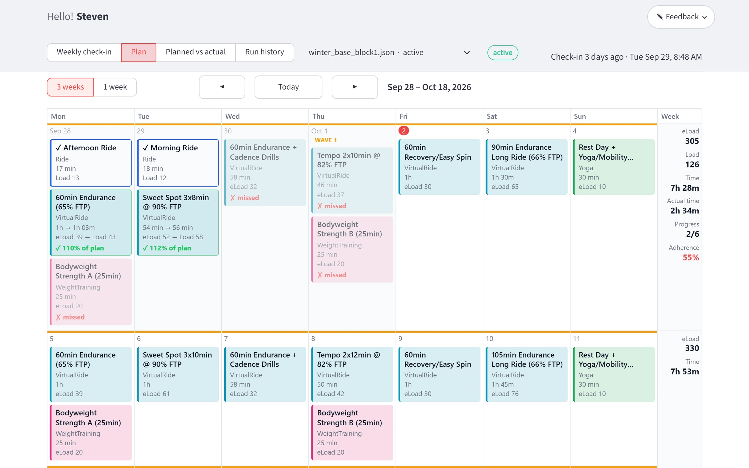
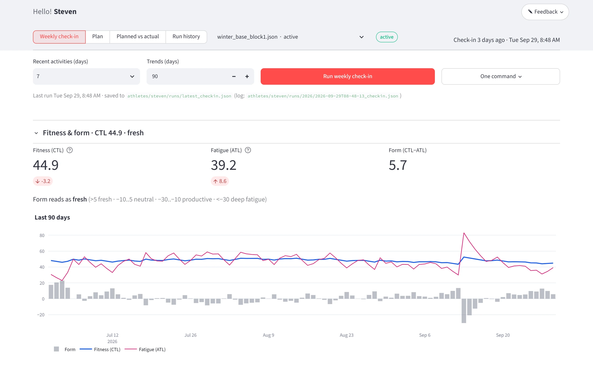
I am committed to becoming a stronger cyclist, and I have become very busy. Claude could already write my training plans and send them to my trainer and head unit, but the only way to review a plan was to read it as output in my terminal. It was impossible to see the big picture, and parsing the details was hard too. Now the dashboard shows my progress and a proposed plan, and Claude and I change it together before it goes to every platform I train with. Claude never drives the app; it reads the same numbers I am looking at.
From a script to a dashboard
The first version was a Python script that pushed workouts to Intervals.icu. Nothing was saved between check-ins.
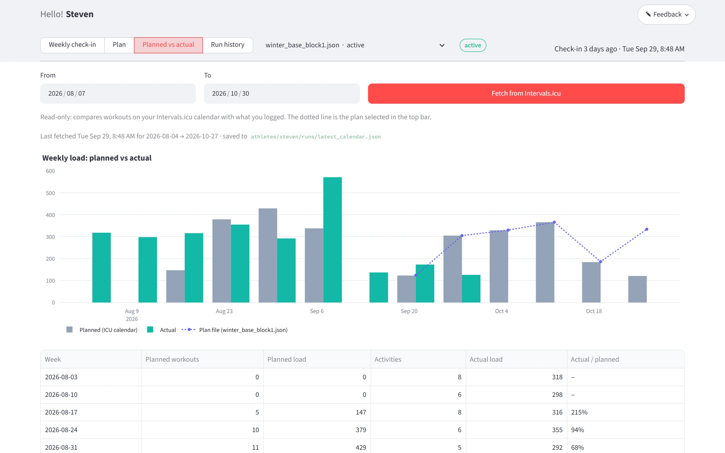
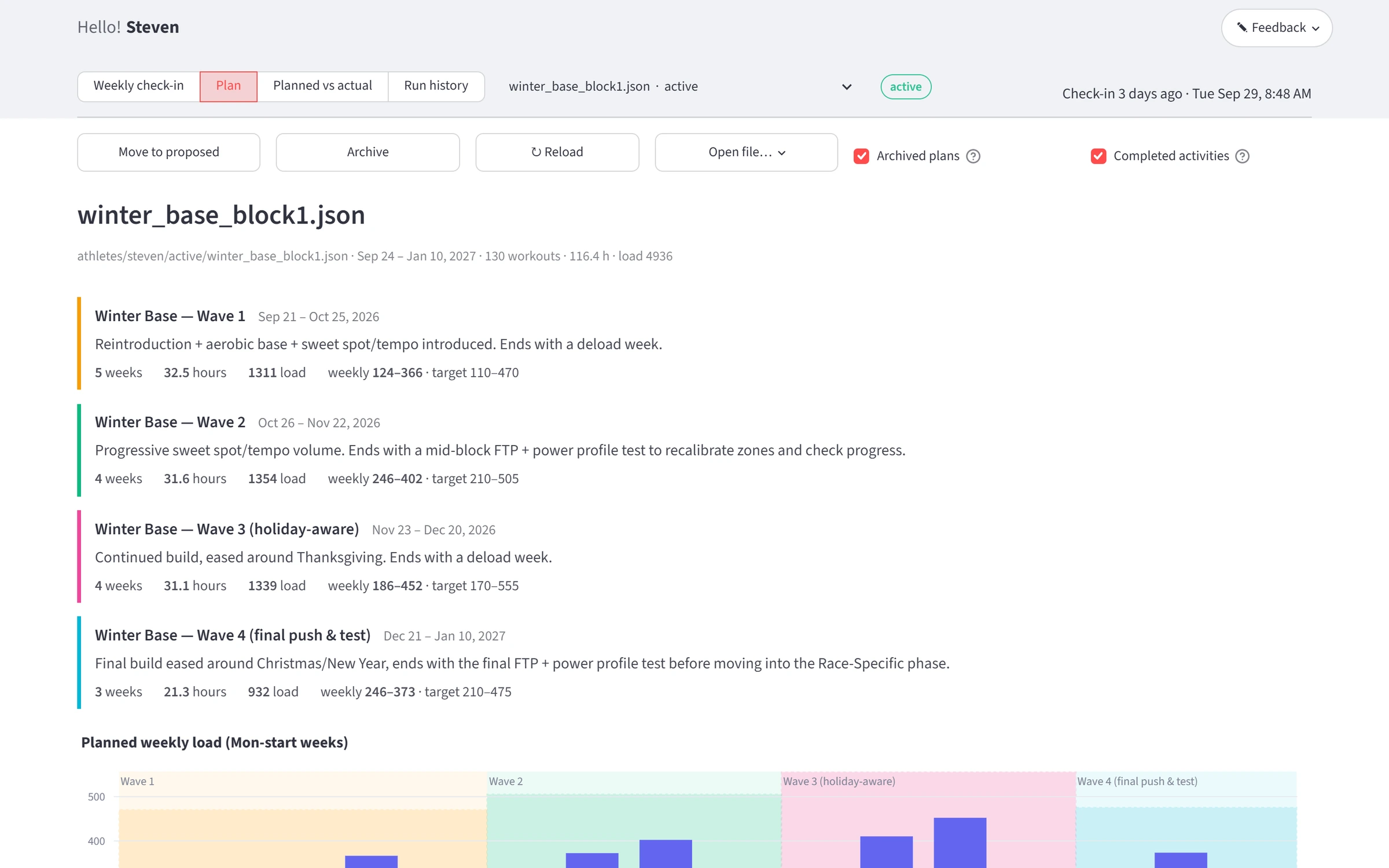
The dashboard runs on my own computer and sits on top of that script. It was built with Claude Code through a series of questions it asked about what I intended. One button runs the weekly check-in. A plan appears as phases, a weekly load chart and a calendar that opens on the current week, with completed rides matched to the workouts they fulfilled.
The method: highlight instead of screenshot
Highlight a specific UI component and describe the changes.
-
Hover
In annotate mode, whatever is under the pointer is outlined and named.
-
Comment
Click, type what is wrong, save. The comment records the page, the nearest heading, the element and its text. No screenshot is taken.
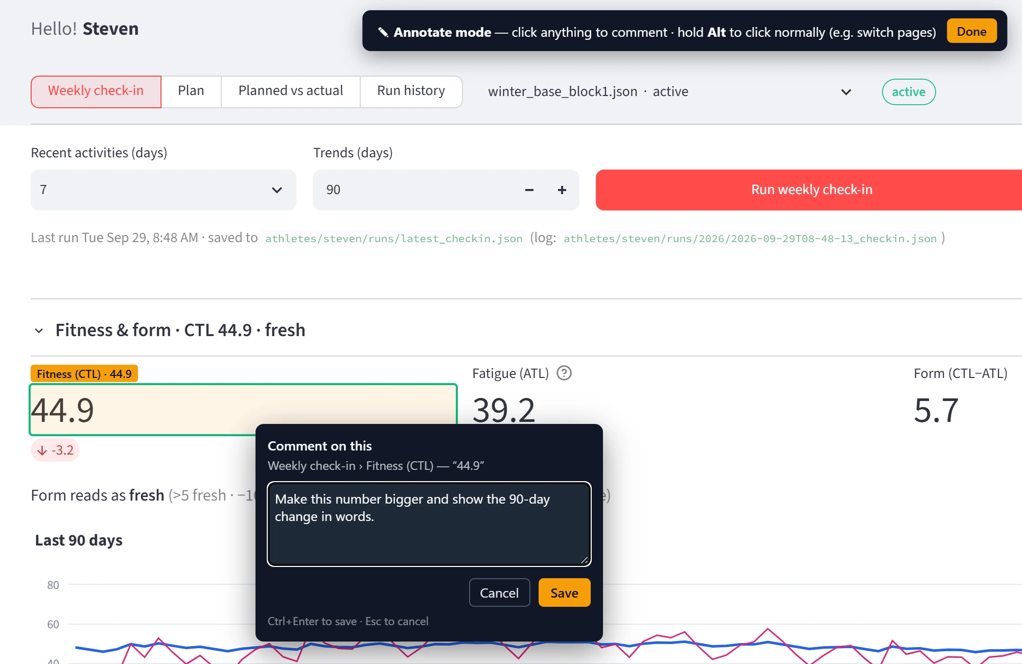
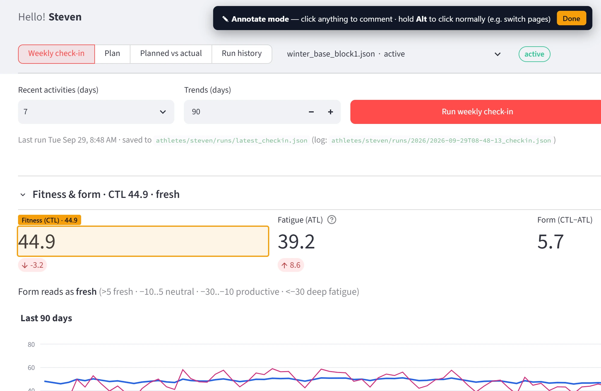
Comment staged for this screenshot -
Resolved
I tell Claude Code to read my UI comments. It finds each element, changes the code, and marks the comment resolved with a note on what it did.
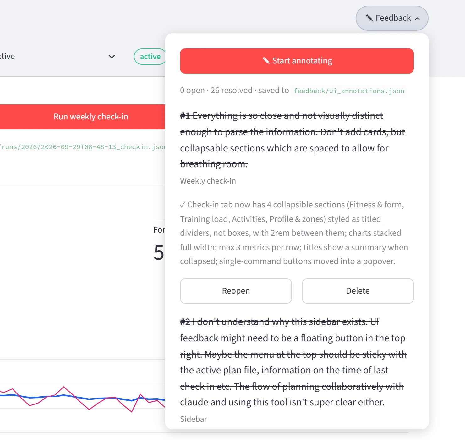
Real comments 1 and 2, with what was changed
- Comments, all resolved
- 26
- Comments on day one
- 19
- Median, comment to fix
- 4 min
From the saved timestamps, September 23 to 27, 2026.
Everything is so close and not visually distinct enough to parse the information. Don’t add cards, but collapsable sections which are spaced to allow for breathing room.
Building it in a week
Changing my mind got cheap
I don’t have to name a component or explain where it is. Comment 12 asked for step details on every calendar card; eleven minutes later, comment 16 asked for them to be removed. Comments also became rules. Comment 24 described, with real numbers from one ride, when a completed activity should count as following the plan. That became the 80 to 120 percent rule, and its test uses the numbers from my comment. One comment asked Claude to write the whole workflow up as a reusable skill and keep it updated from my feedback, so the next interface I need starts from here.
The tool reviewed itself
I also used the tool to review itself. Four of the first seven comments were about annotation mode: the panel covered the page I was trying to annotate, the Done button was broken, and annotate switched itself back on after I closed it.
Two people’s training, one calendar
One morning, with my partner’s plan on screen, I pressed Upload and 101 of her workouts landed on my calendar. For a short while I was signed up for two people’s training. Both were the same kind of mistake: the tool was confident about something it had not checked. Both fixes make it check, and say so on screen.
What went wrong, twice, and the fixes
A dialog in the framework re-runs only itself, the code no longer knew whose plan it was, and it fell back to a default athlete. The default was me. There is no default now: a plan uploads to the account of the folder it lives in, the confirmation names the account, and a test keeps it that way.
The second mistake was quieter. A new plan was uploaded over an old one whose workouts used a different ID prefix. The comparison step could not see them, so 81 old workouts stayed in place and her planned load doubled while the dashboard looked calm. The comparison now reads everything on the calendar and shows other plans’ load on the chart before anything is sent.
What works, what doesn’t yet
Where it stands
The dashboard went from nothing to its current state in one week, September 23 to 29, 2026, in my free time. I can see my progress and the plan ahead in one place, and changing the plan is a conversation instead of a wall of terminal output. Whether the training works is a question two weeks cannot answer.
What isn’t done
There is no phone layout, and three features that came out of the second mistake are built and tested but have not yet met a real case. The first week was not under version control, so the earliest versions of the interface survive only in the text of the comments that changed them. It is now.